Works with the AI tools you already use
Accessibility Bug Hunter for AI Coding Agents
by Shandra
Finds accessibility problems in UI code and turns them into prioritized fixes, WCAG-aware checklists, test plans, remediation tickets, and safe AI coding prompts.
$9.99
· or 50 creditsSecure checkout via Stripe
About this skill
Accessibility Bug Hunter helps AI coding agents, frontend developers, QA teams, product teams, SaaS builders, design-system maintainers, and accessibility-minded creators identify and fix practical UI accessibility issues. It audits components and pages for semantic HTML, keyboard navigation, focus management, visible focus states, accessible names, form labels, error associations, ARIA misuse, dynamic content announcements, contrast risks, modal behavior, dropdowns, tabs, tables, and screen reader risks. The skill creates prioritized accessibility reports, remediation plans, QA checklists, engineering tickets, test strategies, and paste-ready prompts for Cursor, Claude Code, Codex CLI, OpenCode, Replit, and ChatGPT Agents. It is ideal for improving React, Vue, Angular, Svelte, HTML/CSS/JS, SaaS dashboards, forms, checkout flows, admin panels, and design-system components.
How to install
Drop the file into your AI Agent. Works with Claude, Cursor, ChatGPT, and 20+ more.
Details
Reviews
No reviews yet - be the first to share your experience.
Only users who have downloaded or purchased this skill can leave a review.
Be the first to review this skill.
Only users who have downloaded or purchased this skill can leave a review.
Security Scanned
Passed automated security review
Permissions
Allowed Hosts
File Scopes
This skill uses file access to read user-provided UI code, component files, HTML, CSS, JavaScript, TypeScript, design-system notes, test files, README files, accessibility reports, and UI specifications. It uses write access to create structured Markdown/text outputs such as accessibility audits, remediation plans, QA checklists, engineering tickets, test plans, AI coding prompts, verification checklists, documentation notes, and SKILL.md files. Terminal access is optional and should only be enabled when the agent is expected to run tests or accessibility tooling. Browser or network access is only needed for external documentation research. Environment variable access is not required.
Creator

Shandra is a top-ranked AI prompt creator and premium agent skill builder with an established track record in the AI marketplace. She is recognized as a #1 Top Seller on PromptBase, where she has built a trusted catalog of specialized AI prompts and agent skills for creators, entrepreneurs, educators, marketers, digital product sellers, and business professionals. With over 3,500 AI products published, more than 3,400 sales, and 1,000+ five-star reviews, Shandra has become known for creating practical, polished, and commercially useful AI resources that help users save time, organize complex ideas, generate high-quality content, build digital products, and transform creative concepts into actionable workflows. Her Agensi store focuses on premium, ready-to-use agent skills designed for real-world productivity. Each skill is developed with clear instructions, structured workflows, professional formatting, practical use cases, setup guidance, examples, edge-case handling, and a strong emphasis on usability. Her work combines creative strategy, prompt engineering, documentation design, business thinking, and practical automation into reliable tools that users can apply immediately. Shandra’s mission is to create AI skills that feel professional, useful, and complete from the first use — not generic templates, but carefully built workflow systems that help users think better, work faster, and produce stronger results.
Frequently Asked Questions
More Premium Skills
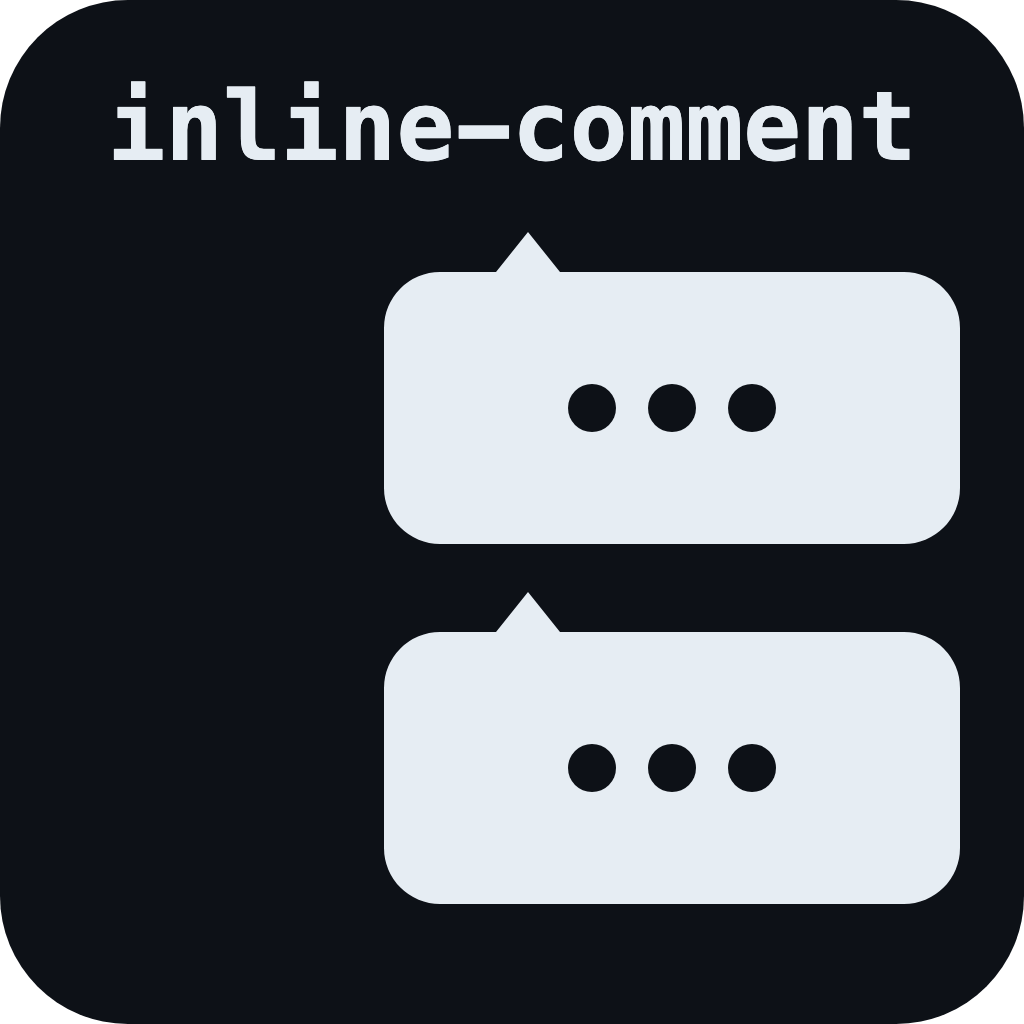
inline-comment
Best way to steer your agents, effortlessly.
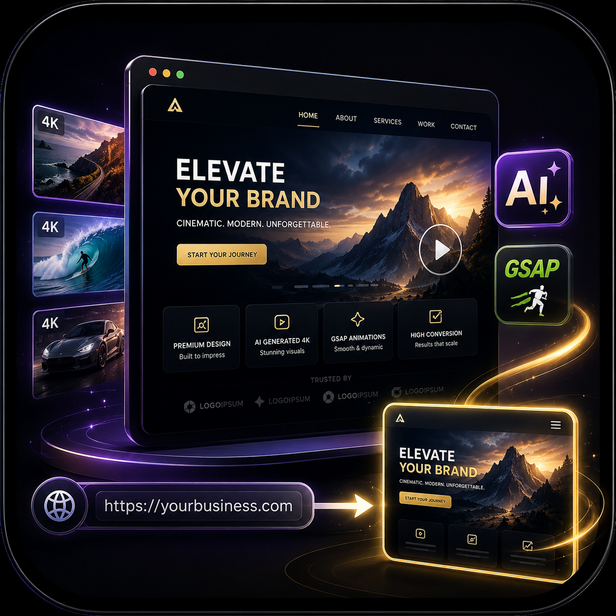
Cinematic Landing Page Builder
Turn any business URL into a high-end animated landing page with 4K AI assets and GSAP animations via Cloudflare.
World-Class Site & App Design
Every AI-built UI looks generic and templated. This skill teaches your agent to actually match the design to the project, the industry, and the audience.
cinematic-sites
Turn any basic business URL into a high-end cinematic landing page with AI-generated 4K assets and GSAP animations.