Works with the AI tools you already use
 Claude Code
 Cursor
 Codex CLI
 Muse
Muse Dots+22 moreClaude CodeCursorCodex CLIMuseDots
 OpenClaw
 Manus
Manus Grok
Grok Grok Bot+18 agents
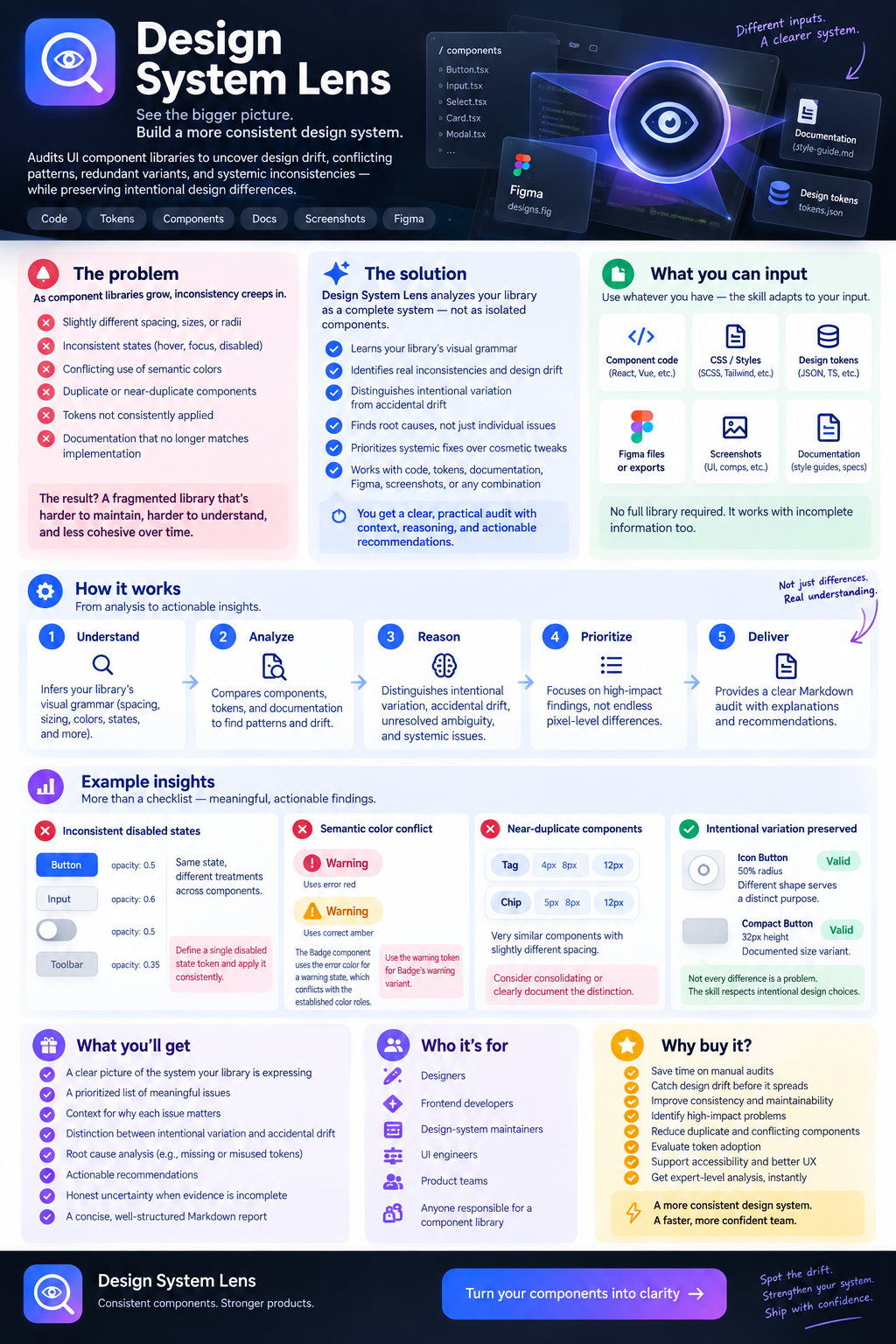
Design System Lens
Audits component libraries to uncover design drift, conflicting patterns, redundant variants, and systemic inconsistencies while preserving intentional design differences.
$9

Design System Lens
Example session with this skill installed
Audit this UI component library for design consistency, with particular attention to conflicting evidence and possible design-system migration.
Current design tokens
- radius-control: 8px
- radius-card: 12px
- radius-compact: 6px
- color-error: #D92D20
- color-warning: #F79009
- control-height: 40px
Existing style guide
- Standard interactive controls use an 8px radius and 40px height.
- Compact controls use a 6px radius and 32px height.
- Error states use the semantic error color.
- Warning states use the semantic warning color.
- All interactive controls must expose a visible focus state.
Existing components
Button
- Height: 40px
- Radius: 8px
- Padding: 0 12px
Input
- Height: 40px
- Radius: 8px
- Padding: 0 12px
Select
- Height: 40px
- Radius: 6px
- Padding: 0 12px
Card
- Radius: 12px
Warning Alert
- Text color: #D92D20
- Border-left: 4px solid #F79009
New design proposal
The design team recently proposed moving all interactive controls toward a 6px radius.
Design note
"New components should gradually adopt the tighter 6px control radius. Existing components are not required to migrate immediately."
New components
Date Picker
- Height: 40px
- Radius: 6px
- Padding: 0 12px
Search Input
- Height: 40px
- Radius: 6px
- Padding: 0 12px
Command Menu
- Height: 40px
- Radius: 6px
- Padding: 0 12px
Additional component
Icon Button
- Width: 40px
- Height: 40px
- Radius: 50%
- Has a visible focus ring
Task
Perform a component-library consistency audit.
Specifically determine
- Which differences are genuine design drift?
- Which differences may represent an intentional migration?
- Does the existing style guide conflict with the newer design direction?
- Should the 6px radius currently be classified as inconsistency, intentional transition, or unresolved?
- Is the warning/error color usage a semantic conflict?
- Should the circular icon button be treated as a consistency violation?
- Are there any issues that cannot be confidently classified from the available evidence?
Do not automatically treat the majority pattern as authoritative.
Do not assume that the oldest rule is necessarily the correct future rule.
Treat implementation, tokens, documentation, and newer design proposals as separate sources of evidence.
For every important finding, clearly distinguish:
- Observed evidence
- Inferred intent
- Conflicting evidence
- Confidence level
- Recommended action
If the evidence indicates that the library is in the middle of a migration, describe the transition rather than forcing all components into the old or new system.
Do not invent undocumented design rules.
Do not flag the circular Icon Button simply because its radius differs from standard controls if its circular shape is intentional and semantically appropriate.
Return the result as a Markdown report that prioritizes systemic and meaningful issues over cosmetic differences.
- Read your context and instructions
- Compiled the design system lens
- Generated the UI component
UI Component Library — Design Consistency Audit
System overview
The library expresses a fairly disciplined
two-tier control system: a "standard" tier (8px radius / 40px height) and a "compact" tier (6px radius / 32px height), each documented and tokenized (radius-control, radius-compact, control-height). Cards sit outside this system entirely, using radius-card (12px) as a container-family token — that's expected, not a conflict, since cards aren't interactive controls.
Layered on top of that stable system is a
proposed but partial migration: new components adopting a 6px radius while keeping the 40px "standard" height — a combination the current style guide doesn't describe. That's the central story of this audit; most of the meaningful findings trace back to it.
Finding 1 — The 6px radius is a genuine migration in progress, but the token model hasn't caught up
Observed evidence:
- Style guide defines two bundled tiers: standard (8px + 40px) and compact (6px + 32px).
- Button and Input match the standard tier exactly.
- Date Picker, Search Input, and Command Menu — all new — consistently use 6px radius at 40px height, not 32px.
- The design note explicitly frames this as intentional: "New components should gradually adopt the tighter 6px control radius. Existing components are not required to migrate immediately."
Inferred intent: The design team is decoupling radius from height. Historically, radius and height moved together per tier; the new direction treats radius as an independent axis, heading toward "6px is the new universal control radius" while height stays governed separately.
Conflicting evidence: The style guide itself still states standard controls use 8px, with no mention of a transitional or dual-radius state. Documentation has not been updated to reflect the proposal, so the guide and the newest implemented components directly disagree on what a standard-height control's radius should be.
Confidence: High that this is an intentional transition (the design note says so explicitly) — not drift. Low-medium confidence on where the transition currently stands relative to the compact tier (see Finding 2).
Recommended action: Treat this as an active migration, not a bug to "fix" toward either extreme. The style guide should be updated to describe the transitional state explicitly (which components/tiers are on which system), and a decision should be made on whether radius-compact (6px) is being repurposed as the new default control radius or whether a new token (e.g. radius-control-v2) should represent it — right now the same 6px value is doing two different semantic jobs (see Finding 2).
Finding 2 — 6px radius currently has two unreconciled meanings; Select's status is unresolved
This is the most important classification question in the audit, so treating it plainly:
- In the original system, 6px radius means "compact tier" and implies 32px height.
In the new proposal, 6px radius is being used at 40px (standard) height, with no compact-height counterpart shown.
Select — an existing component, not listed among the new ones — already uses 6px radius at 40px height, matching the new pattern rather than the compact tier it nominally belongs to under the old rules, and rather than Button/Input, its closest family members.
Observed evidence: Select's radius/height combination is identical to the new components' pattern.
Conflicting evidence: The design note frames the 6px shift as something for new components; Select isn't listed as new. Yet its values already match the target state.
What can't be resolved from the evidence given: Whether Select is (a) an early/quiet adopter of the new direction that predates the formal proposal, (b) pre-existing drift that coincidentally now resembles the target pattern, or (c) evidence the migration is already further along than the design note suggests. There's no changelog, versioning, or component history provided to distinguish these.
Confidence: High that Select is inconsistent with its own family (Button, Input) under the current documented rules. Low confidence on cause/classification (migration vs. drift) — this should be labeled
unresolved, not forced into either bucket.
Recommended action: This is a question for the design team, not something the audit can settle: confirm whether Select is intentionally ahead of the migration or should be reconciled with Button/Input. Either answer is a small change; the risk is leaving it ambiguous, since it currently reads as neither fully "old system" nor officially "new."
Finding 3 — Warning Alert mixes error and warning semantics within one component
Observed evidence: Warning Alert's text color is #D92D20 — which is the
error token, not the warning token — while its border-left accent uses #F79009, the warning token.
Why it matters: The style guide states warning states must use the semantic warning color. A component named and presumably functioning as a warning is using the error color for its primary (text) content, with only the secondary accent (border) matching its actual semantic category. This is the kind of within-a-single-component mixing the skill treats as a real bug regardless of any migration story — there's no "old system vs. new system" explanation available here, no documented severity-escalation convention, and no other component shown that mixes tokens this way.
Conflicting evidence: None found that would justify this as intentional — no documented rule allows a warning component to borrow error color for emphasis.
Confidence: High on the observation (it's a direct token comparison). Medium-high that it's a genuine violation rather than a deliberate severity cue, since nothing in the provided rules supports the latter reading.
Recommended action: Align Warning Alert's text color with the warning token, unless there's an undocumented design rationale (e.g., a deliberate "high-emphasis warning" pattern) — in which case that rule should be written down, since right now it isn't distinguishable from a mistake.
Finding 4 — Icon Button's circular shape is not a consistency violation
Observed evidence: Icon Button uses 50% radius (fully circular) instead of any of the standard radius tokens, but matches the standard control footprint (40×40px) and explicitly documents a visible focus ring.
Assessment: This is a case where a differing radius is semantically justified rather than drift — a circular treatment for a single-icon, symmetrical action is a well-established and purposeful pattern, distinct in shape because its content and purpose differ from rectangular text/label controls. It sizes consistently with the standard control family (40px) and meets the one hard interaction rule the style guide states (visible focus state) more explicitly than any other component in the provided data.
Confidence: High that this is intentional variation, not a violation.
Recommended action: None. Worth documenting the circular treatment as a recognized exception in the style guide so future reviewers don't need to re-derive this reasoning.
Finding 5 — Focus-state compliance can't be verified for most components
Observed evidence: The style guide mandates a visible focus state on all interactive controls. Only Icon Button's data explicitly confirms this. Button, Input, Select, Date Picker, Search Input, and Command Menu have no focus-state information provided either way.
What can't be confidently classified: Whether these components comply. Absence of a stated focus treatment in the data given isn't evidence of absence in the actual implementation — this is a gap in the material provided, not a finding.
Recommended action: Not a fix — a request for evidence. If this is being audited from real component code/CSS rather than a summary table, confirming focus-visible styles across the rest of the control family would close this gap.
Not flagged (checked, no issue found)
Card's 12px radius — a distinct token for a non-control, container-level family. Different treatment here is expected, not inconsistency.
- Padding (
0 12px) — uniform across every control shown, old and new alike. No drift.
Error/warning token definitions themselves — the tokens are cleanly separated; the problem in Finding 3 is misapplication, not the token design.
Summary classification (direct answers)
| Question | Answer |
|---|---|
| 6px radius: drift, migration, or unresolved? | Intentional transition at the system level (documented), but unresolved in its relationship to the compact tier and in Select's specific status |
| Style guide vs. new proposal | Yes, they conflict — the guide hasn't been updated to reflect the proposed direction |
| Warning/error color usage | Yes, a genuine semantic conflict in Warning Alert specifically |
| Icon Button circular radius | Not a violation — semantically justified shape difference |
| Highest-leverage fix | Reconcile the radius/height token model (Finding 1) and resolve Select's status (Finding 2) — most other findings are downstream of these two |
design-system-lens.tsx
TSX · React component
Example file from a real run - the skill writes it into your workspace.
Connects securely to your tools. The creator never sees your data.
What you get
About this skill
How to install
Works the same in every agent - Claude, Cursor, Codex, Copilot and 20+ more.
- 1
Download the ZIP
Free skills download straight away. Paid skills unlock right after purchase.
- 2
Unzip into your skills folder
Every agent reads skills from one folder on your machine. Drop the unzipped folder in there.
- 3
Ask your agent to use it
Restart the agent if it was already running. It picks the skill up automatically - no config needed.
Skills folder by agent
Click the path to copy it. Create the folder if it does not exist yet.
Reviews
No reviews yet
Be one of the first to try it. Every listed skill passes our trust checks below.
Security scanned
Passed our 8-point scan before listing
Fresh listing
Recently published to Agensi
30-day refund
Not a fit? Get your money back
Trust & safety
Security scanned
Verified clean 16 days ago
- Passed all security checks, Safe to install