Lux Visual Systems Bundle
The Lux Swiss and Tri-Swiss Supporter Editions in one purchase. Each includes its interface system plus the shared Image Direction workflow.
Choose Lux Swiss for the restrained ink/cream/red system, or Tri-Swiss for its governed turquoise highlight. Load Image Direction when a project needs illustrations, editorial graphics, photographic treatments or technical visuals. Use one interface system per surface; the bundle gives you both choices.
The same Image Direction skill is included in both packs. The bundle provides two interface systems and that shared image-direction workflow, without requiring a separate Image Direction purchase.
The interface cores remain publicly available under their existing licenses. Your purchase adds the included image-direction workflow and managed access through Agensi, and supports continued independent development. Thank you for backing that work.
An image generator and credits are not included. Agensi MCP serves text, not binary image pixels: the packaged master and three curated reference PNGs need to be visible through the host for close visual matching. Text specifications and reference descriptions are included.
Works with any agent that signs in to Agensi, such as Claude, ChatGPT, Claude Code, Cursor and Codex CLI.

One payment, lifetime access. 2 skills unlock instantly in your library.
What's included
2 skills
Lux Swiss interface system with Image Direction included. A Supporter Edition for coherent UI and imagery that also supports independent development.

Tri-Swiss interface system with Image Direction included. A Supporter Edition for coherent UI and imagery that also supports independent development.
See it in action

Lux Visual Systems - Lux Swiss Supporter Edition
Example session with this skill installed
I need a new React card component for a user profile using the Lux Swiss design system. It should show an avatar, name, bio, and an 'Edit' button. Make it look good for dark mode too.
- Read your context and instructions
- Compiled the lux visual systems
- Generated the UI component
I have generated the Lux Swiss profile card. It utilizes the card elevation token (--card), hard 1px borders, and the Space font flavor. The layout follows the system's strict duotone rules with zero shadows and uppercase mono labels for metadata.
Lux Swiss Profile Card
import { User, Edit3 } from 'lucide-react';

export default function ProfileCard() {
  return (
    <div className="w-full max-w-md border border-border bg-card p-6 transition-colors">
      <div className="flex items-start gap-6">
        {/* Avatar Container with hard border */}
        <div className="flex-shrink-0 border border-border bg-background p-1">
          <User className="h-12 w-12 text-foreground icon" />
        </div>

        <div className="flex-grow">
          {/* Metadata Label */}
          <span className="font-mono text-xs uppercase tracking-[0.2em] text-muted-foreground">
            User Profile
          </span>

          <h2 className="mt-1 font-display text-2xl font-bold text-foreground">
            Erik Spiekermann
          </h2>

          <p className="mt-4 font-sans text-sm leading-relaxed text-foreground/80">
            Type designer and information architect. Focused on grid systems,
            legibility, and the restraint of duotone interfaces.
          </p>

          <div className="mt-6 flex items-center justify-between border-t border-border pt-4">
            <button className="flex items-center gap-2 font-mono text-xs uppercase tracking-[0.2em] text-muted-foreground hover:text-foreground transition-colors">
              <Edit3 className="h-4 w-4 icon" />
              Edit Settings
            </button>

            <div className="h-2 w-2 rounded-full bg-primary" title="Status: Active" />
          </div>
        </div>
      </div>
    </div>
  );
}
Next steps
- Ensure
assets/theme.cssis imported in yourlayout.tsxorglobals.css. - Add the
.darkclass to the<html>element to preview the near-black and cream dark mode variant. - Verify that the
Space GroteskandSpace Monofonts are loaded via Google Fonts.
Included Image Direction example
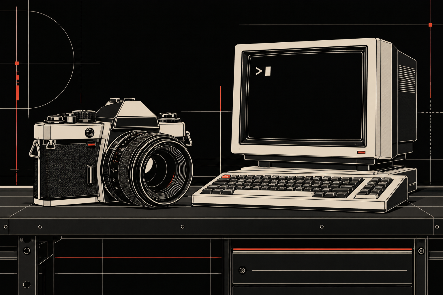
Actual local Codex image-generation example: a camera and terminal on one workbench, technical-vector style, dark mode, cream and red accents. This image was generated from the text workflow; it is not a test of Agensi image-file delivery.
theme.css
TSX · React component
Example file from a real run - the skill writes it into your workspace.
How to use
- 1
Connect your agent to the Agensi MCP
Copy the prompt and paste it into Claude, ChatGPT, Cursor or any agent that supports MCP. It sets up the connection for you. Manual setup
- 2
Sign in to Agensi
Your agent shows a sign-in link. Sign in and click Allow.
- 3
Ask for what you need
Your agent loads these skills and uses them on your task. It always asks before buying a skill.
Reviews
No reviews yet
Be one of the first to try it. Every skill in this bundle goes through our trust checks.
Security scanned
Checked by our 8-point scan before listing
Fresh listing
Recently published to Agensi
Money-back guarantee
Doesn't do what its page promises? You get your money back.